
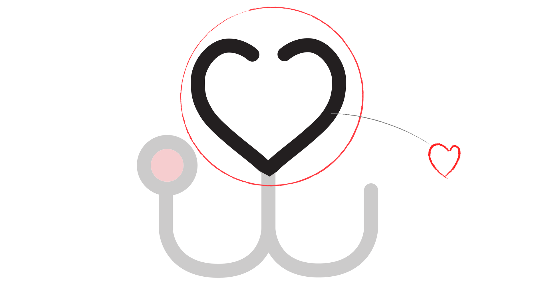
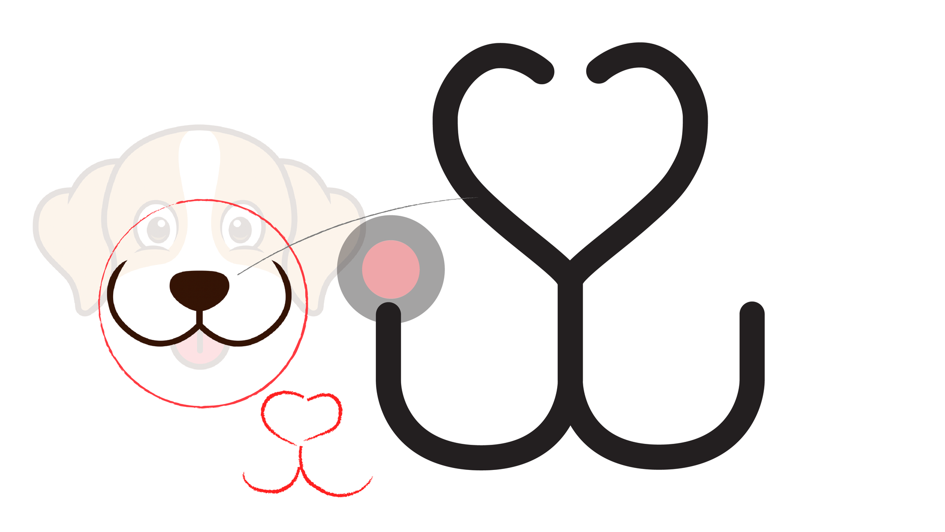
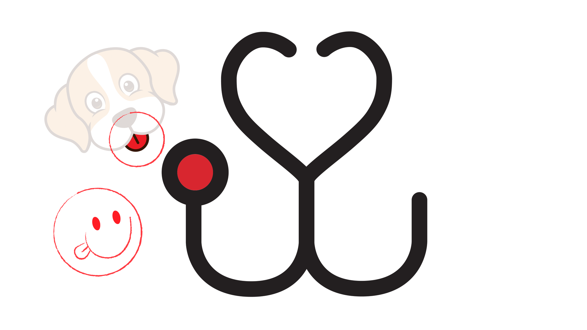
WAGGY PAWS BRAND IDENTITY
BRANDING / LOGO DESIGN
Elegance and Assurance: Lant Insurance's Timeless New Twist!
VERTICAL
TECHNOLOGY
BRIEF
Rebranding Lant Insurance
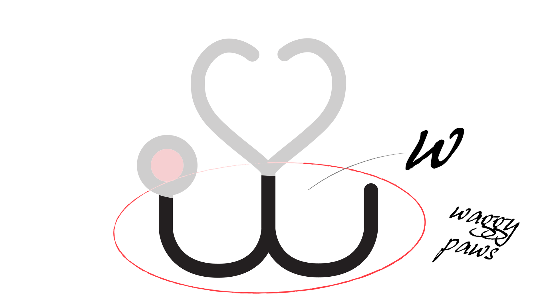
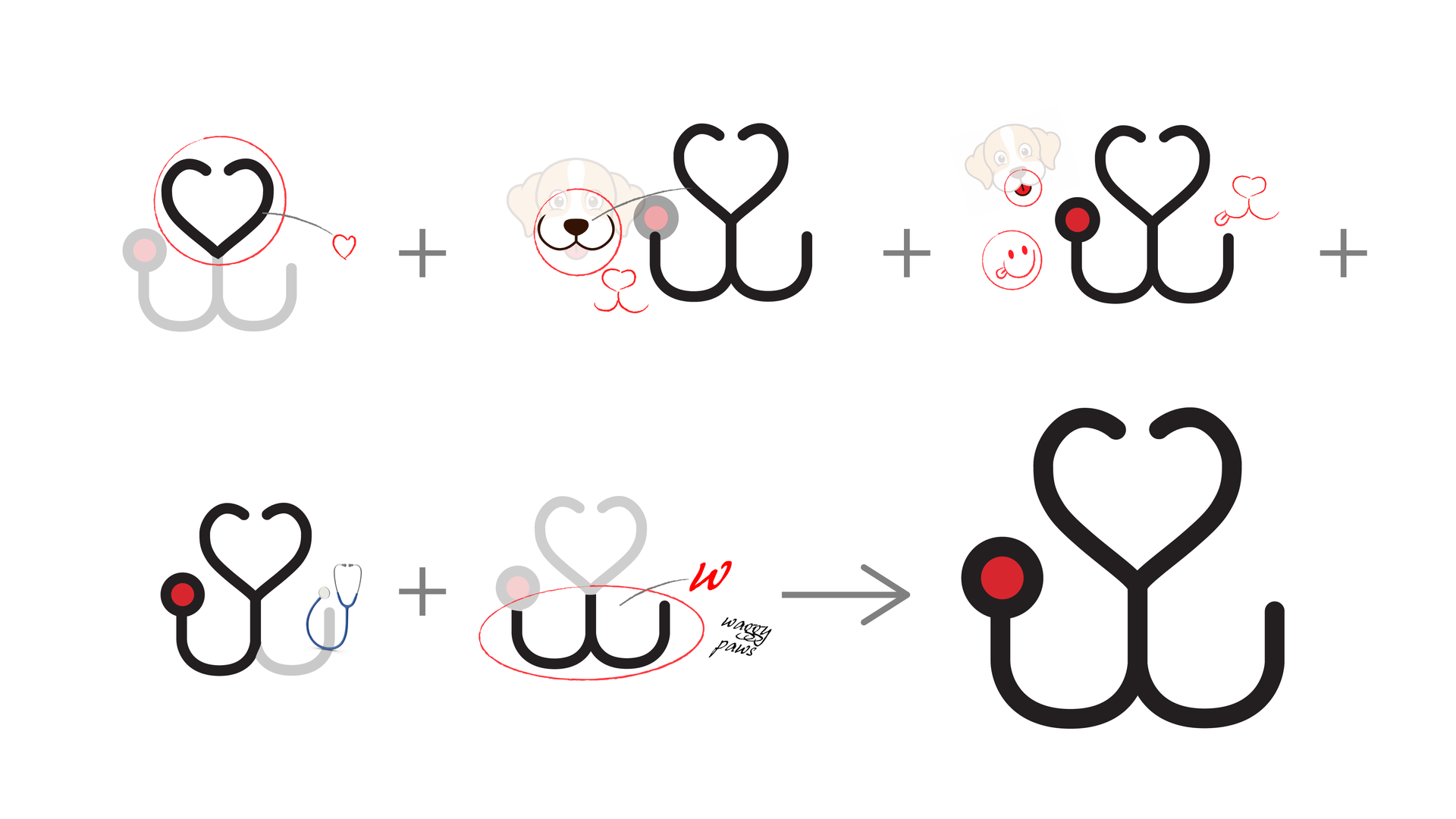
The goal was to create a brand identity that captured the essence of technology, love, and innovation, all while keeping the adorable factor alive.
CHALLENGE
Overcoming a Generic Legacy
The challenge was unmistakable: the existing logo of Lant Insurance was a plain Jane – a mere Arial font with no unique features to distinguish it in the bustling market. It was essential to break away from this nondescript image and create something that not only caught the eye but also told a story. The logo’s lack of character was a blank canvas awaiting a transformation that could breathe life and identity into the brand.
SOLUTION
Crafting a New Identity
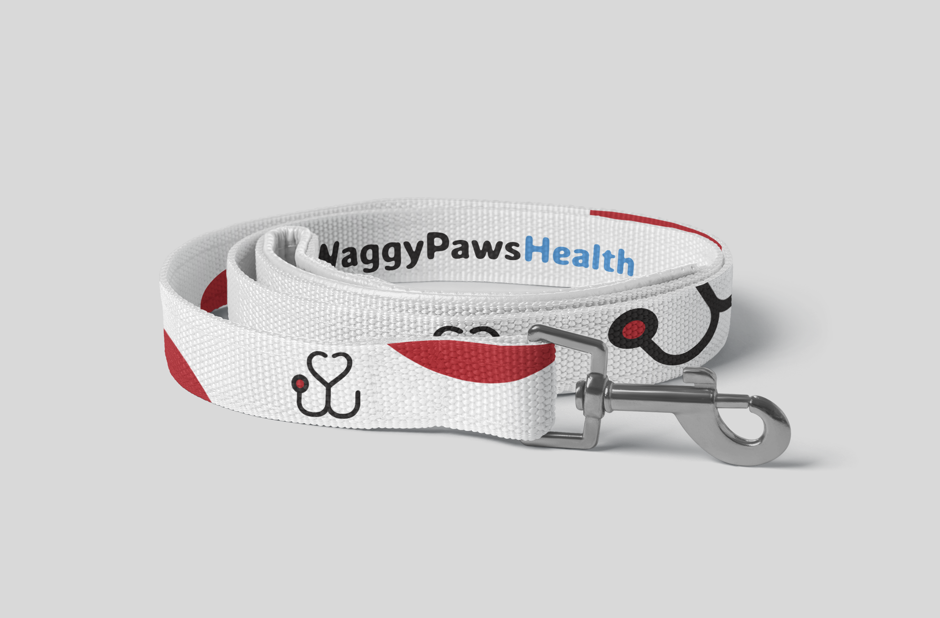
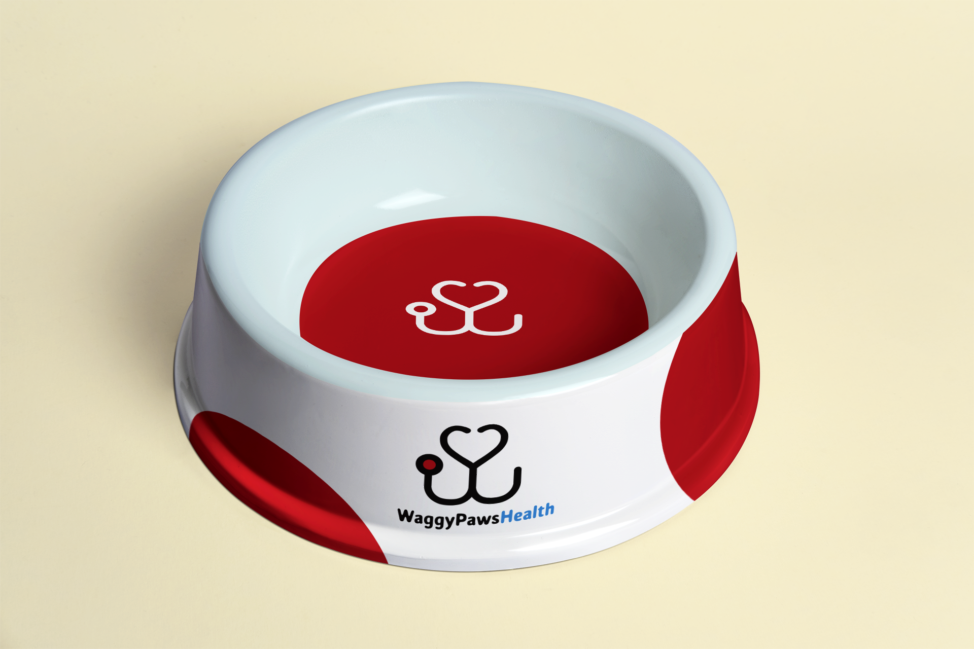
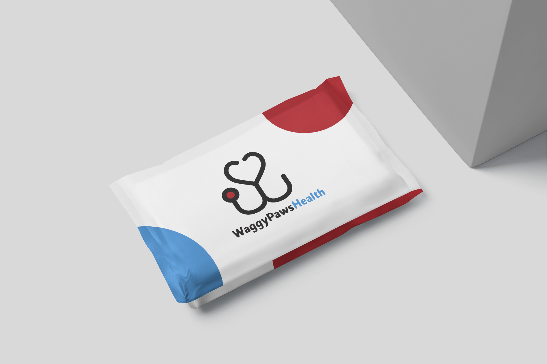
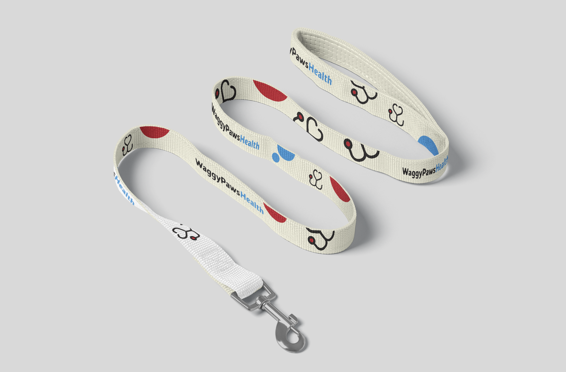
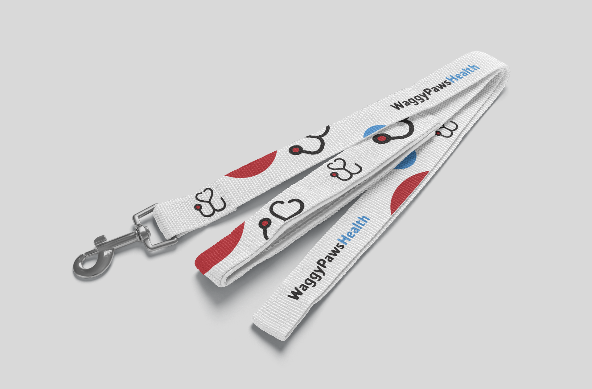
This creative endeavour was all about capturing the love, innovation, and care central to Waggy Paws' approach towards merging technology and pet health. Every detail has been crafted with skill and heart, resulting in a visual feast that will make you smile. The result is more than just a branding exercise; it's a celebration of all the warmth, care, and love that are key to the pet world. Prepare to be enchanted!


"ArtBeat'S work was phenomenal. I’ve done a lot of rebranding in my career, and the team understood the essence of our business and delivered a logo and a creative campaign that absolutely knocked it out of the park."
Fabian Aird,
Marketing Director


